VIVID SYDNEY
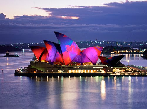
Vivid Sydney, a festival of light, music and ideas, starts this Thursday 27th May.
Best known for the amazing light show 'Lighting the Sails' at the Sydney Opera House, Vivid is a fantastic creative event for Sydneysiders and visitors alike. There is everything from creative focus groups, live performances, fire shows, food stalls and markets.
The event runs until Monday 21st June, and with such variety the Mokum studio will be penciling a couple of events into our diaries so we don't miss out. If you are in Sydney you may like to do the same.
2010 TRENDS
 Clockwise from top: Textile View issue 88 p:161, Polka Dots styled by Kai Z Feng in 'Lula' Spring 2010, Dorit on her way to Proposte, Mokum's Bruges Lace -052 Frost, Textile View issue 88 p:123 - Blue Forecast , Mokum's Brocatelle and Etoille - 231 Chartruese.
At Mokum we strive to offer the latest in design so it’s imperative that we are regularly exposed to international trends. Visiting Proposte is a great opportunity for us to research global trends and connect with the very best European mills. However the way in which trends influence our brand is quite different to other faster paced industries like fashion, where trends can change dramatically from season to season. We need to ensure the trend is not only appropriate for our customers homes but also has longevity. It isn’t every day we replace our curtains or recover a sofa so we want to get it right. We do make certain we still deliver the wow factor, particularly in fabrics suitable for cushions, which allow us to easily update the home. Of course for us as designers the statement items are often the most fun and challenging to work on. The exhibitors at Proposte are the crème de la crème so it isn’t surprising a number of trends were evident across their individual ranges. Here is a couple that we noted:
Colour Trends:
- Yellow green, like our designs ‘Etoile’ and 'Brocatelle' - Chartreuse or the beautiful multi purpose wool ‘Sateen’ – Mimosa.
- Dark Blue. We have seen indigo, ink blues and grey blues appearing in fashion for some time now so this was one we expected. It is a nice change from black!
- Grey based neutrals were shown across the fair, which isn’t particularly new for Australia and NZ – as this trend has been present for some time but I guess for European countries this was a change from more yellow based neutrals. I love the look of grey and dark blue together and judging by fashion I believe it’s a colour partnership we will see more and more in interiors. A good example of this colour combination is ‘Chatelet’ - Prussian Blue paired with ‘Coupole’ - Pewter or Quartz from Mokum’s latest collection Moderne.
- Metallic’s. Again metallic’s are not a new concept however we saw a textile woven from a true gold yarn which was something I certainly had never seen before. It was gorgeous and had real weight to it but I can’t see it being used in many domestic homes, that is unless you live in a palace!
- Digital Prints. The effects that can be created by digital prints now are extraordinary; we saw fabric printed to look identical to kilims. When laid on the floor you would swear you were walking on the real thing.
- Checks, Stripes and Polka Dots were everywhere! Mostly very traditional but some mills had applied the idea quite differently in big chunky chenille and lurex yarns.
- French Knots is an embroidery technique, and we saw entire designs done in multi coloured French knots.
- Soft Linens. There were so many beautiful soft linens both for drapery and upholstery exhibited at Proposte. Many had airo finishes which give the fabric a relaxed ‘used’ look. Walking through the streets of Como I noticed this trend was also mimicked in men’s suits and jackets. Italian men dress really well!
- Crochet and Lace. Last but not least we saw a number of stunning lace and crocheted draperies at Proposte, and lace was also translated into prints for upholsteries. Although call me bias, but I still believe one of the nicest lace constructions around is Mokum’s Bruges Lace.
PICTURE PERFECT
 Top to bottom: Istanbul Turkey, stained glass windows in the Blue Mosque and Hagia Sophia, hand painted detail at Topkapi Palace.
Lake Como, Italy
On Friday I am going to be sharing the trends we saw at Proposte (some new and expected, some not), but for now I would like to show you a few of the things which made me stop and take a picture whilst we were away. Dorit will tell you there was more than one or two of these moments. When she asked me to look after the photography I don’t think she realised quite how snappy happy I can be! Here are a couple of my favourites.
WHAT IS RAILROADING?
We are often asked to explain the textile term "railroading".
It simply means that the design has been sampled and displayed perpendicular to how it's woven. i.e. how it comes off the roll. For example our upholstery jacquard Khepresh is woven as per below:

It has been “railroaded” within our samples and in all marketing collateral to illustrate the direction we believe it should be upholstered. See below:


For drapery, only wide width designs (300 cm) can be railroaded, as it allows curtains to be made without any vertical joins. This is referred to as a “continuous” fabric.
A continuous curtain can be made from 300cm wide fabric when the window height is under approximately 280 cm in height. This allows an extra 20cm for the curtain header and the bottom hem, this is an approximate guide only as it depends on the style of curtain choosen.
For example Lexington has a selvedge to selvedge repeat woven as per below.


The correct direction to display Lexington as a curtain

It simply means that the design has been sampled and displayed perpendicular to how it's woven. i.e. how it comes off the roll. For example our upholstery jacquard Khepresh is woven as per below:

Upholstery jacquard Khepresh

Railroaded Khepresh design

A Khepresh cushion
For drapery, only wide width designs (300 cm) can be railroaded, as it allows curtains to be made without any vertical joins. This is referred to as a “continuous” fabric.
A continuous curtain can be made from 300cm wide fabric when the window height is under approximately 280 cm in height. This allows an extra 20cm for the curtain header and the bottom hem, this is an approximate guide only as it depends on the style of curtain choosen.
For example Lexington has a selvedge to selvedge repeat woven as per below.

Lexington selvedge to selvedge repeat

The correct direction to display Lexington as a curtain
A Lexington curtain
WHERE IN THE WORLD ARE WE?


Dorit and I had a brilliant trip away, it was both motivating and eye opening. Later in the week we will tell you more about it, as I'm sure we will be more articulate once the jet lag has worn off. For now above are some pictures from our travels. Can you guess where we are?


Subscribe to:
Posts (Atom)

